Working with data can feel messy when you have just numbers on a spreadsheet. Patterns aren't always obvious, and insights often get buried. That's where histograms help, turning complex data into clear insights.
In this article
However, many histogram tools are either confusing or too basic. I've tested plenty and was often disappointed—until I found Edraw.AI.
It combines automation with an intuitive interface, making histogram creation effortless. In this guide, I will show you exactly how to make histograms easily using Edraw.AI.
What Is a Histogram?
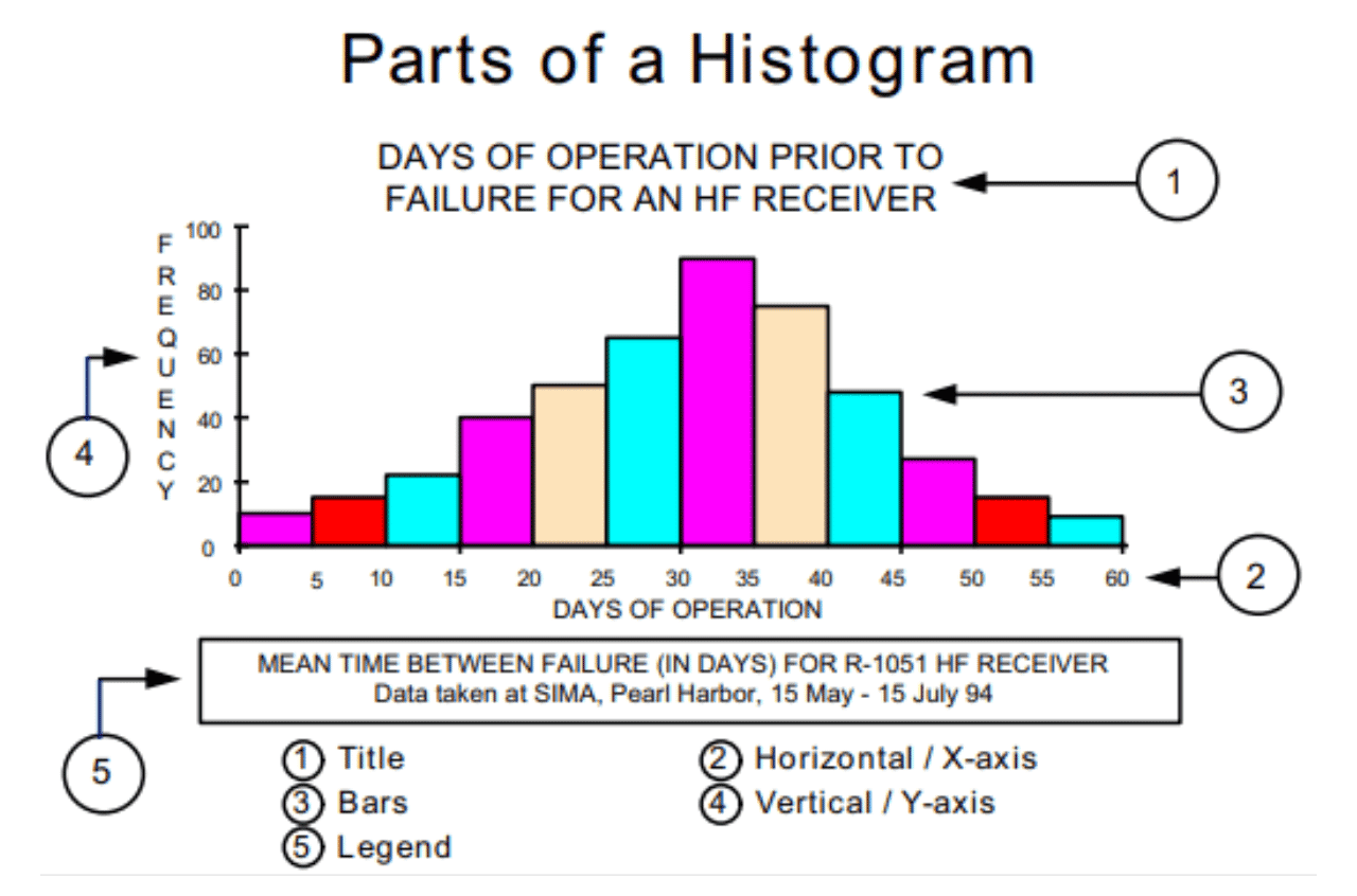
A histogram shows data distribution using bars. Think of a test where scores vary. Some scores are high, some low, and many are in between. Instead of listing every score, it groups them into ranges and shows counts with bars.
Why Use a Histogram?
Histograms uncover hidden patterns in data. For example, if you're tracking website traffic, a histogram can show which hours see the most visitors. If you're analyzing sales, it can reveal revenue peaks and dips. This makes it easier to adjust strategies based on trends.
How Does it Differ from a Bar Chart?
A histogram differs from a bar chart. Its bars touch because the data is continuous, like age or income ranges. Bar charts space bars apart to compare separate categories like product sales.
Using a histogram helps you quickly view large data sets. It speeds up decision-making.
How to Create a Histogram in Edraw.AI?
Edraw.AI's AI automation makes histogram creation effortless. You can seamlessly generate pro-level, accurate charts, whether you're a beginner or a pro. Let's look at the methods.
Method 1: Make a Histogram Using the Column Chart feature
When I set out to make a histogram on Edraw.AI, I started with a blank canvas and built everything by inserting a pre-made chart.
This method reliably creates histograms for advanced customization. It's also straightforward enough for beginners who are just starting with online histogram creation.
Here’s how to do it:
Step 1Create a New Diagram
- Log in and click the + New button on the home page.
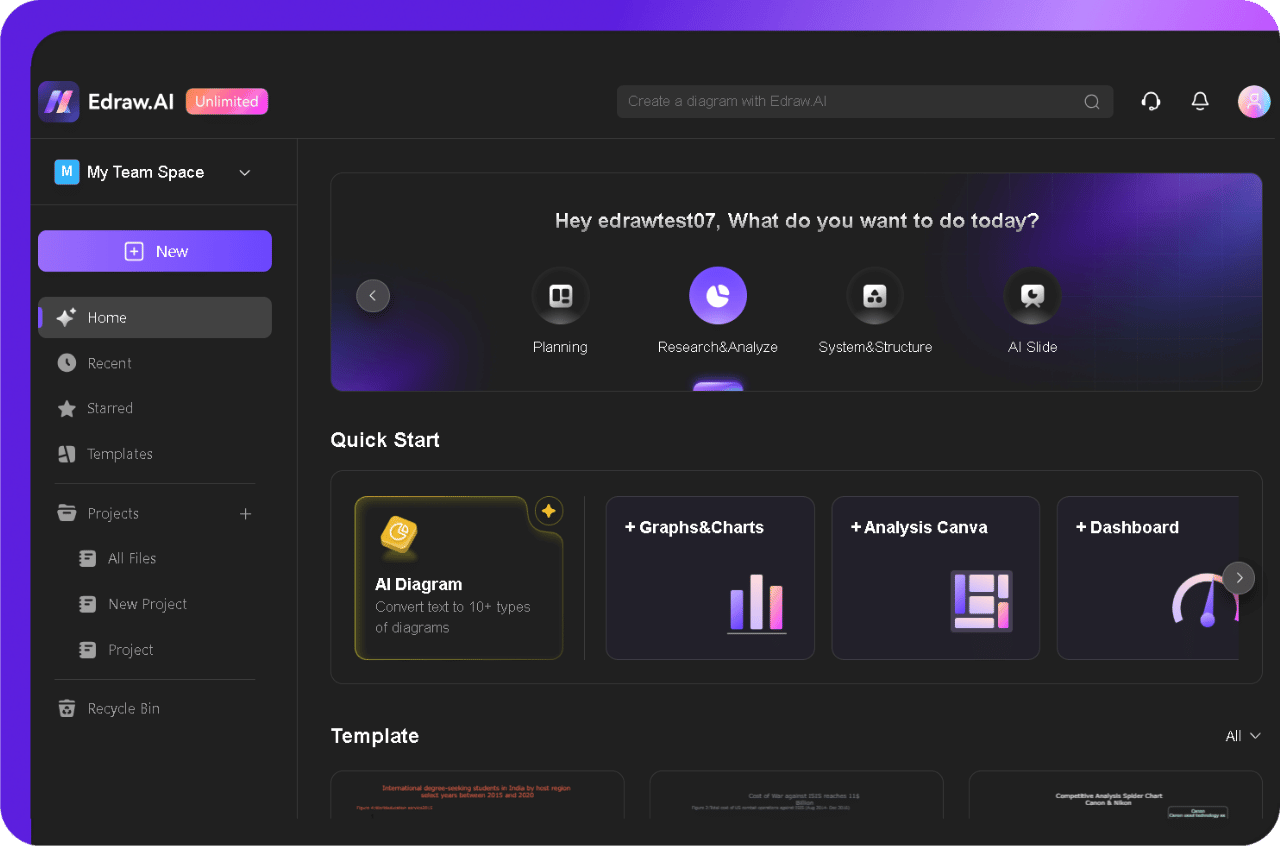
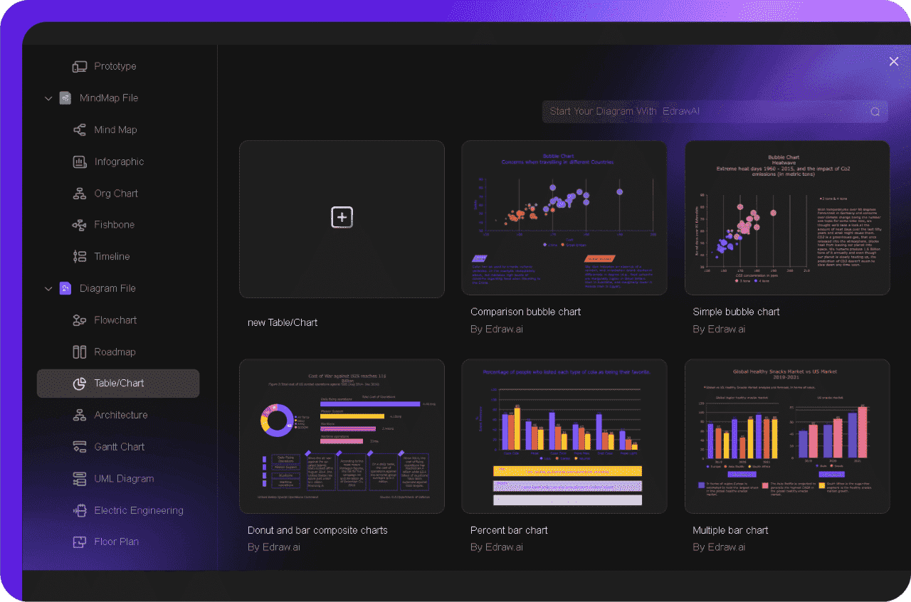
- Select Table/Chart from the left-hand menu and then click New Table/Chart.
- It opens a fresh workspace to start from scratch without any preset limitations.
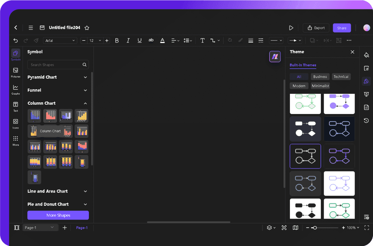
Step 2Add a Column Chart from the Symbol Library
- Once the canvas is ready, browse the symbol library and locate the Column Chart for your histogram.
- Click it to insert the column chart into the canvas.
- It serves as the base structure for a histogram.
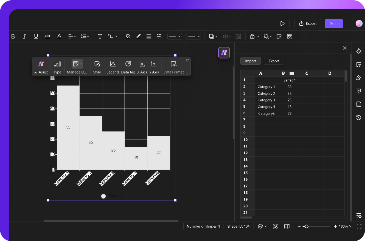
Step 3Add Your Data
- Tap on the chart to open the data panel from the Data Manager button in the pop-up menu to enter your values directly.
- If your data is already organized in a spreadsheet, click Import to add it directly to your histogram.
- I usually use the import feature because it saves time, especially when working with larger datasets.
Step 4Customize the Design and Text
- After populating the chart with data, work on the chart design, format, and text, if required.
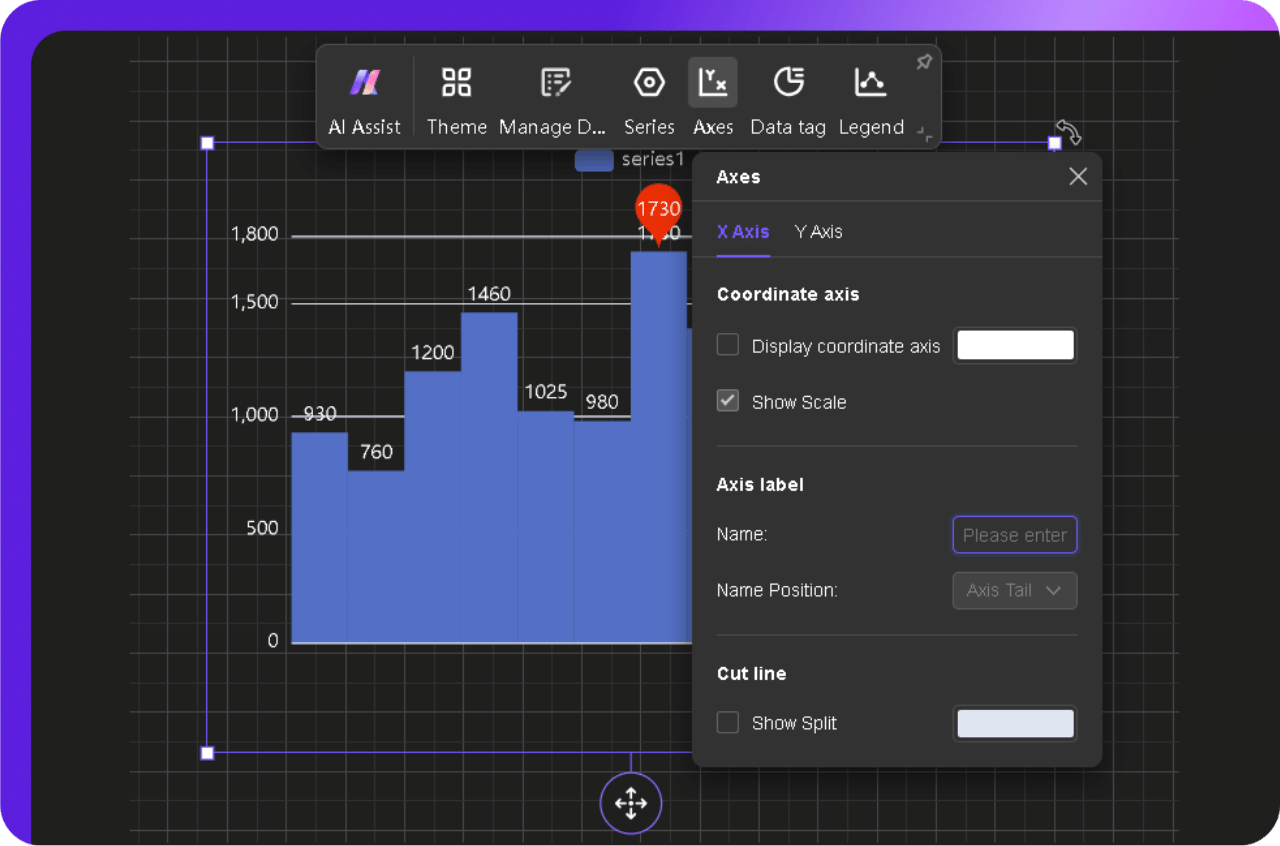
- Use the pop-up menu buttons to modify Style, Data Tag, Legend, Axis, and Data Format.
- I usually customize the theme style quickly by choosing built-in themes from the right-side Theme panel.
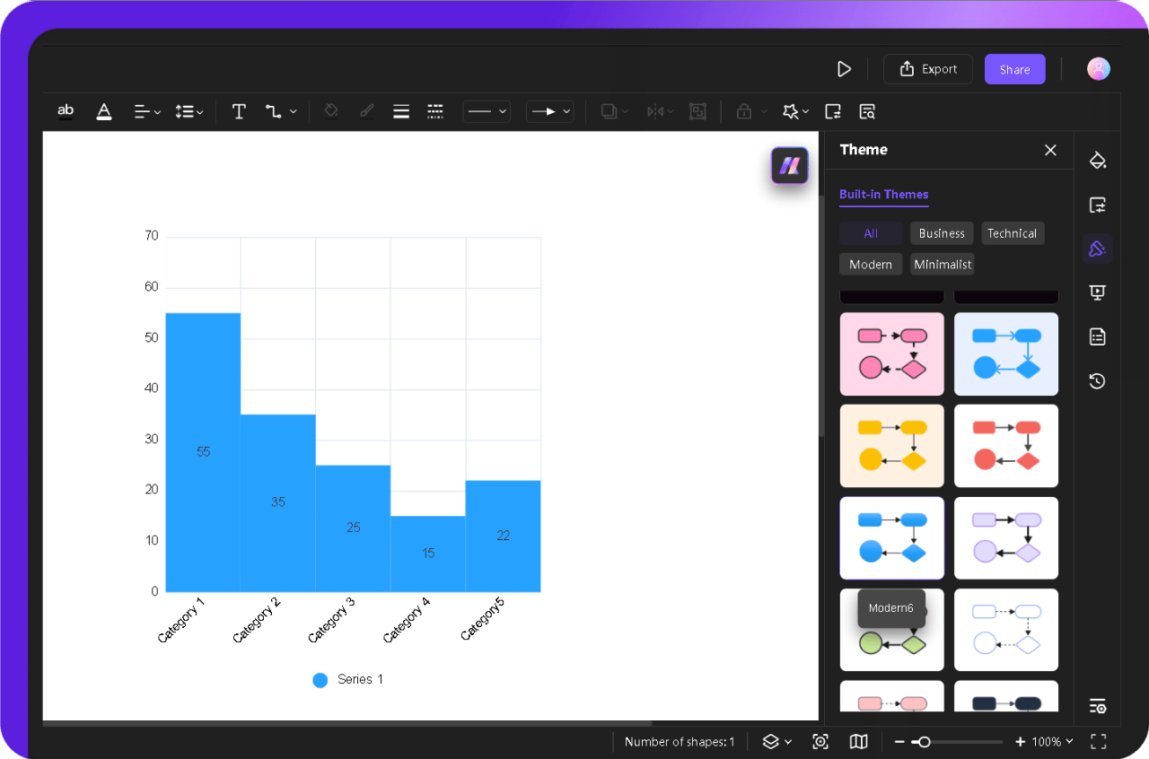
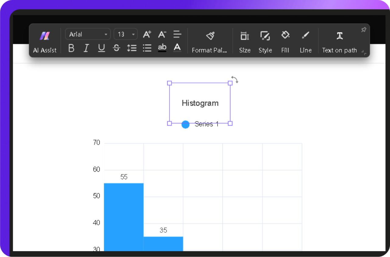
- Double-click on the top to add your histogram title. Click and drag it to set its position.
- Select a text to modify fonts, style, size, colors, and more from the pop-up menu.
- It makes the histogram easy to understand and visually aligned with the information needed to convey.
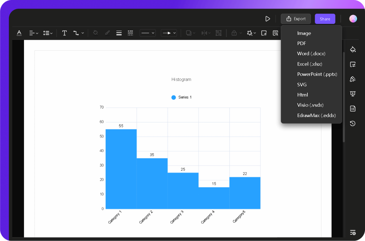
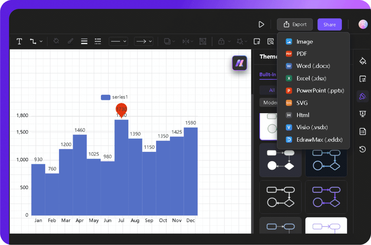
Step 5Export or Share Your Histogram Chart
- When satisfied with the layout and data, hit the Export button. Choose a format—image for presentations, PDF for print, or another preferred one.
- If I need to collaborate or get feedback, I also use the Share button to generate a link I can send directly to my team.
If you're short on time or just want the fastest way to generate a histogram, Edraw.AI’s built-in AI can do the heavy lifting. Let’s see how it works.
Method 2: Create an Instant Histogram with AI Quickly
If you don’t want to get into the manual setup, AI builds your histogram in seconds. It’s excellent for quick, structured charts, whether you’re analyzing statistics, tracking performance, or managing frequency counts.
Follow these steps to begin.
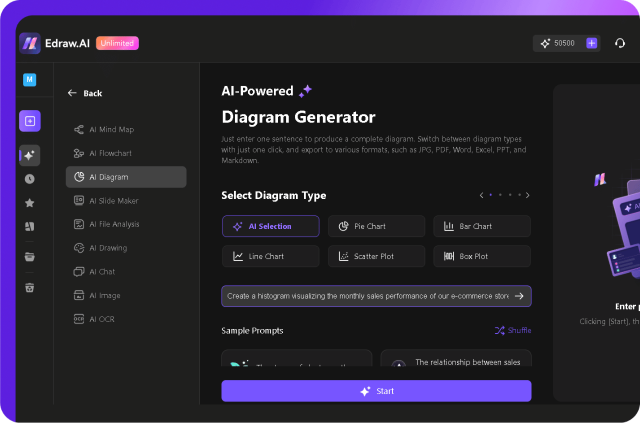
Step 1Open the AI Diagram Feature
- On the homepage, click Research&Analyze, then choose AI Diagram.
Step 2Describe Your Histogram
A prompt box will appear where you can specify the details of your histogram.
- Select your diagram type or let AI automatically choose the best option using AI Selection.
- Type a detailed description of what you need.
Example Prompt: "Create a histogram visualizing the monthly sales performance of our e-commerce store for the year 2024. The X-axis should display months in chronological order (January to December), and the Y-axis should represent the total revenue generated in each month. Use revenue intervals of $500 on the Y-axis. Clearly highlight the bar representing the month with the highest total revenue."
- Once you’re ready, click Start to process your request.
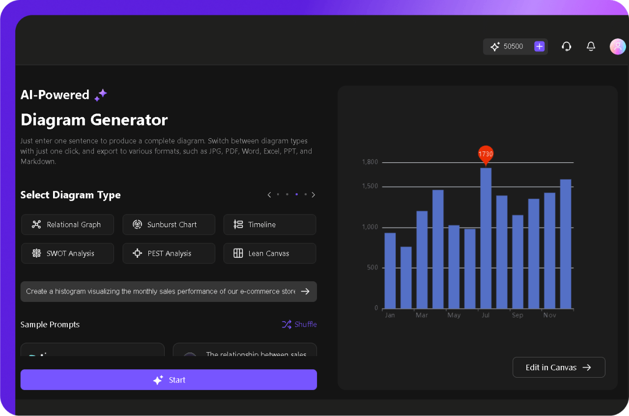
Step 3Review and Refine the AI-generated Histogram
- Edraw.AI will generate your histogram within seconds.
- You can edit the histogram manually or refine your prompt to regenerate it.
- Click Edit in the Canvas to modify it with Edraw.ai’s intuitive interface.
Step 4Customize the Histogram for Clarity
- Edraw.AI provides easy-to-use customization options to fine-tune your ai-generated histogram.
- Select the chart and set the series gap to zero from the Series button in the pop-up menu.
- Tap on the chart and drag the edges to resize it as required.
- Click and drag the whole chart to reposition it wherever you need it.
- Modify the Axis, Data tag, Legend, Theme, and more from the same pop-up menu.
- Use preset styles for a professional look.
Step 5Export or Share Your Histogram
- Once you’re done editing, download the histogram by clicking the Export button.
- Choose a format based on your needs:
- Alternatively, click Share to generate a collaboration link for your team.
Add Try Edraw.AI online for free here.
Best Tips for Creating Histograms
Here’s what I’ve picked up from working with various histogram-making tools like Edraw.AI.
1. Define Your Bins Wisely
Don’t just trust the default bin size. Too many bins make the graph chaotic, and too few hide key patterns. A solid starting point is the square root of your data count—adjust from there based on distribution.
2. Use a Uniform Scale
Inconsistent bin widths distort data interpretation. Always keep them even unless you have a statistical reason not to, like modeling probability density. Edraw.AI lets you tweak this easily.
3. Choose the Right Data Type
Histograms are built for continuous numerical data. If you're working with categories, switch to a bar chart instead. Misusing data types skews results and weakens analysis.
4. Label Clearly
Unclear labels confuse viewers. Always specify measurement units and avoid vague terms like "big" or "small." If your data covers wide ranges, annotations can help highlight key trends.
5. Keep Colors Functional
Color should enhance, not distract. Stick to a single shade unless you're comparing datasets, in which case, use subtle contrasts. Edraw.AI's customization options make this simple.
6. Verify Your Distribution
Before jumping to conclusions, study your histogram's shape. Is it skewed, symmetrical, or bimodal? Each tells a unique story. Adding a standard distribution curve (if relevant) can provide extra clarity.
Crafting an effective histogram is all about control. Never let default settings dictate your results.